Introduction
The ClusterWare Graphical Interface (GUI) provides a graphical interface to monitor and manage the cluster. Both the GUI and the command-line interfaces (detailed in Installation & Administrator Guide and Reference Guide) employ the same underlying interfaces to the ClusterWare database.
The GUI is available on all head nodes using a browser to access http://<HEADNODE_IP>. The default authentication is done through PAM, so the administrator should use their existing credentials for the head node.
The Grafana Monitoring Dashboard (see Monitoring Graphical Interface) is also
available on all head nodes,
either by clicking on the Monitoring link on the left of the Cluster
Overview page (see below) or by accessing http://<HEADNODE_IP>/grafana.
The Grafana default credentials are the username "admin" and the
database.admin_pass from the base.ini:
sudo grep admin_pass /opt/scyld/clusterware/conf/base.ini
The cluster administrator is welcome to change the password within the Granafa graphical interface.
Cluster Overview Page
After a successful login, the user sees the Cluster Overview page, which presents the basic cluster health and status in a summarized display of different elements shown as panels arranged in a multi-column layout.
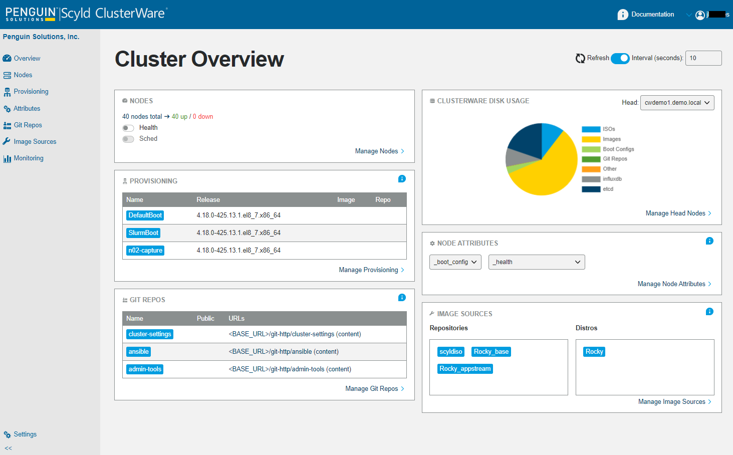
For most desktop viewports the panels will be stacked into 2 columns. For smaller viewports the columns will collapse to one.
At the top of the Overview is an "i" icon and "Documentation". Clicking on that "Documentation" takes you to the top of the ClusterWare HTML documentation. In the upper right of each panel is an "i" icon, and clicking on that icon takes you to the relevant textual information for that panel in the ClusterWare HTML documentation.
A link at the lower right of each panel (labeled Manage <panel-name>), or the panel title in the sidebar on the left side of the Cluster Overview, will take the user to that panel's information shown in greater detail.
The Refresh control is also on all pages and controls how often the GUI retrieves database contents. The user can adjust that to change the time interval or to disable automatic updates altogether.
The Overview's ClusterWare Disk Usage panel's Manage Head Nodes link (see Heads Page) takes you to the Overview Heads page that displays disk usage and head node details. That Overview Heads is only available through the ClusterWare Disk Usage panel's Manage Head Nodes link.
Most of the more detailed Manage <panel-name> pages show various entries (e.g., the lists of nodes, boot configurations, administrators, Git repositories) listed row by row in a table. Typically in the far right of each table entry is a so-called more menu, reachable by clicking on the "..." dots.
Administrators Page
In the upper right of the Overview page and each page showing specific panel details is the name of the current cluster administrator with a caret icon to its left, signaling that it can expose a pulldown menu. Clicking on the admin name or the caret exposes that pulldown menu, which presents two selectable items: Manage Users and Logout.
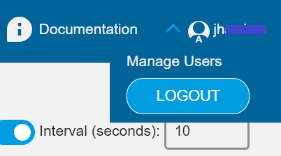
Click on Manage Users to display the list of all cluster administrators,
including the so-called "auth.tmpadmins" defined in the head node's
/opt/scyld/clusterware/conf/base.ini.
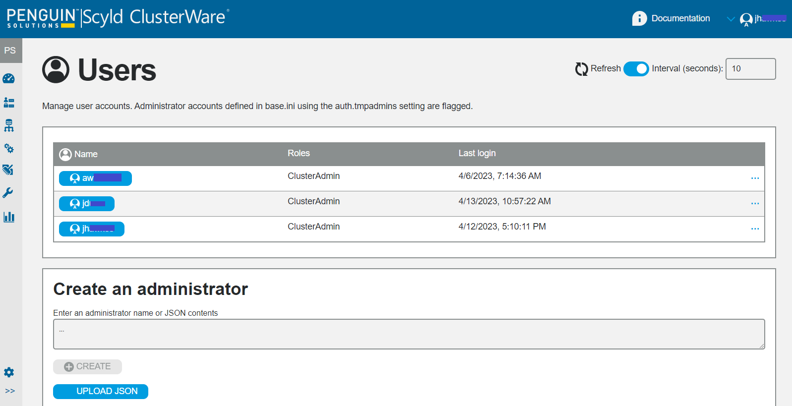
Accounts can be deleted clicking on the more menu "..." for an entry.
To provide users with a consistent GUI layout, certain GUI settings are stored in the ClusterWare database document associated with the user's account. These settings can be cleared through the more menu.
A Create an administrator text box that allows you to add a new administrator by name or by JSON contents.
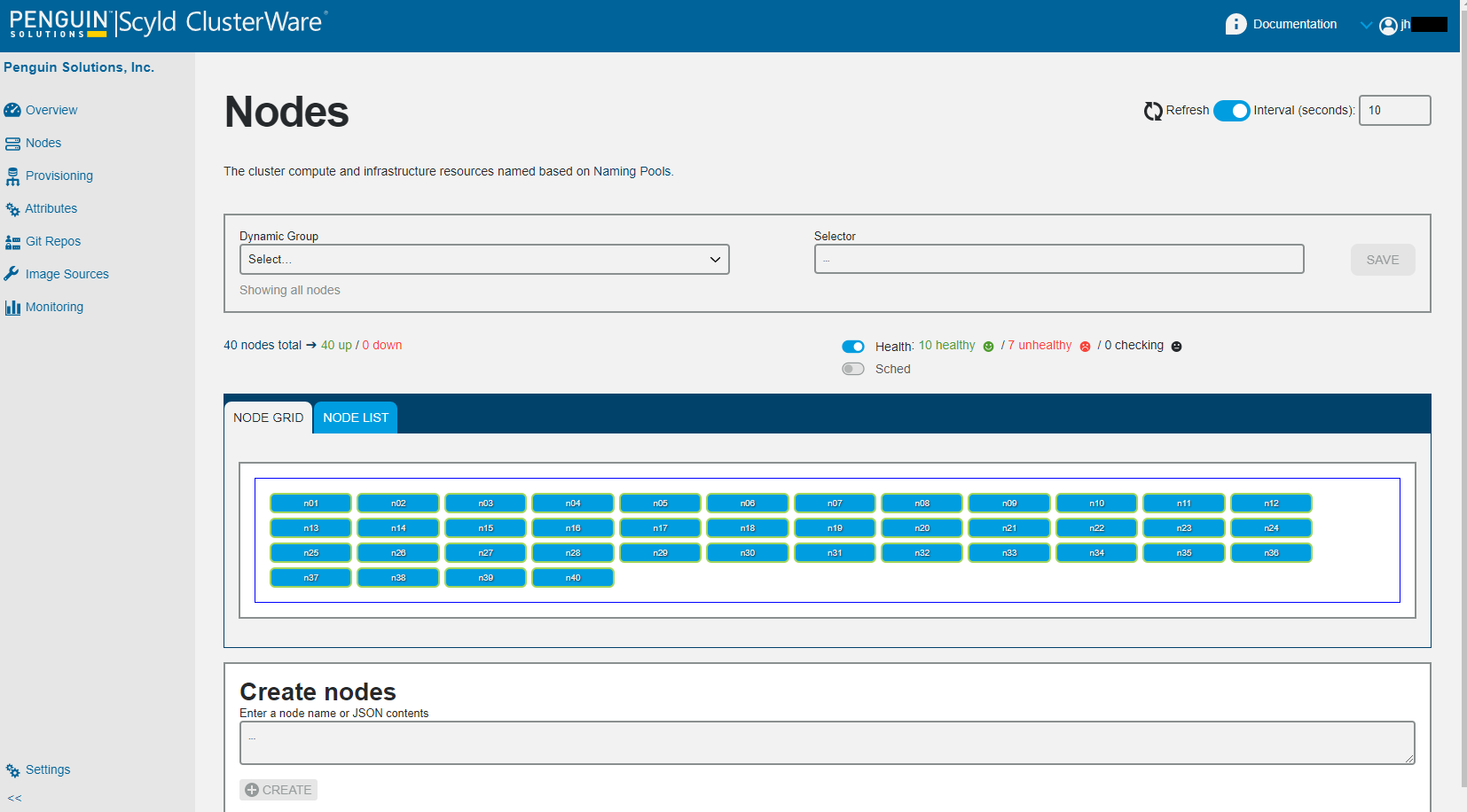
Nodes Page
From the Cluster Overview page, click on Nodes in the sidebar on the left or the Manage Nodes link in the Overview's Nodes panel to display the Nodes page.
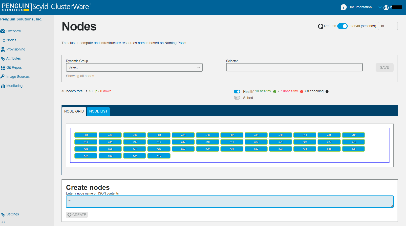
At the top of the Nodes page is a Node Filtering subpanel (see Node Filtering below), and below that is a summary of the total node count, the counts of "up" vs "down" nodes, and the counts of healthy vs. unhealthy nodes. These summary lines are clickable links that will overwrite the node selector to select just the nodes in that summary. For example, clicking on "7 unhealthy" will select just the nodes currently reported as "unhealthy".
If you are using a job scheduler, such as Slurm, you can toggle the Sched switch to show scheduler status. For details on installing job schedulers, see Job Schedulers under Additional Software. For details on configuring job schedulers to work with ClusterWare, see Appendix: Monitoring Scheduler Info.
Below the Node Filtering subpanel is the Node Grid/Node List subpanel showing each node in a potentially filtered display. Each node is color-coded to indicate status and health, reflecting status or state of the nodes in a way that the cluster administrator can quickly see any anomalies.
The Create nodes text box at the bottom of the page, with a jump-to link at the top if needed, i.e. the Node Grid/Node List is long, allows the user to create new nodes. The only field required to add a new node to the cluster is the MAC address. The user can supply a JSON string that adds multiple nodes.
For example, to create five compute nodes, you could provide:
[ {"mac":"FF:11:22:33:44:55"}, {"mac":"11:22:33:a4:fe:66"}, {"mac":"22:33:44:55:66:77"},
  {"mac":"00:99:88:77:66:55"}, {"mac":"ef:45:fd:43:23:54"} ]
Or you can create a node with multiple fields, such as:
{ "mac": "11:22:33:44:55:66", "attributes": { "_boot_config": "SlurmBoot" }}
Node Filtering
Node Filtering enables administrators to view, create, and manage subsets of compute nodes and can be used to select subsets of the full set of nodes for display in Node Grid or Node List mode.
A filter can be defined and saved as a Dynamic Group, which is dynamic in the sense that a specific filtering criteria may show different nodes when applied at different times.
These are the actions that a user could take in the Node Filtering section:
Select a Dynamic Group - If the user selects an option from the Dynamic Group menu, this means they are loading a pre-existing selector. The "Selector" field populates with the associated selector text, the Dynamic Group description is displayed beneath the Dynamic Group field (using ellipsis if it is too long), and the list of displayed nodes updates per the Selector.
Enter a Selector Expression - Once a valid selector has been entered, the list of displayed nodes updates per the Selector expression. In addition, the user will be given the option to save this Selector expression as a Dynamic Group, so a "Save" button will appear, indicating to the user that they have that option. If the user clicks the "Save" button, then a "New Dynamic Group" modal pops up allowing the user to enter a required, unique Dynamic Group name and an optional description. Once saved, the Dynamic Group is created and saved. The interface updates the Dynamic Group menu to include the newly created group.
Select "Manage Dynamic Groups" from the Dynamic Group menu - The list of options in the Dynamic Group menu will always include "Manage Dynamic Groups" as a menu option at the bottom below a horizontal line to indicate that it is a "special" menu item. Clicking on that takes the user to a completely different page where all the Dynamic Groups can be further managed.
Modify a Selector Expression of a Dynamic Group - Once a valid new selector is detected, the action "Save" button appears (which replaces selector for current Dynamic Group) and a "More" button appears which gives two options: "Save As" and "Revert". The "Save As" button brings up a modal allowing user to enter a name for a new Dynamic Group (preserving the original), and "Revert" will effectively reload the currently "Dynamic Group" and reset buttons according.
Reset - Undo filtering.
Node Grid Display
The Node Grid is a row/column grid display where each node is represented by a cell. Above the grid display is a panel containing node status summary information and display options. Each node/cell conveys data with its visual properties:
Label - This is the node name that appears on the cell. Long names are truncated. The full name is visible in the Node cell.
Node status - The background color of the cell indicates node status: blue=UP, red=DOWN, orange=BOOTING, outline (no background color)=NEW.
Scheduler status indicator - This indicator is present only if Slurm is configured. Possible values: UNKNOWN, READY/IDLE, BUSY, UNUSABLE/ERROR. If the indicator is ERROR, there may be an accompanying error message. This will be displayed when the user hovers over the Scheduler Status Indicator.
Users can interact with cells in two ways:
Hovering: Exposes a popup containing additional identification and status information about the node.
Clicking: Exposes a popup containing more details than what is seen in the Hovering popup.
Node List Display
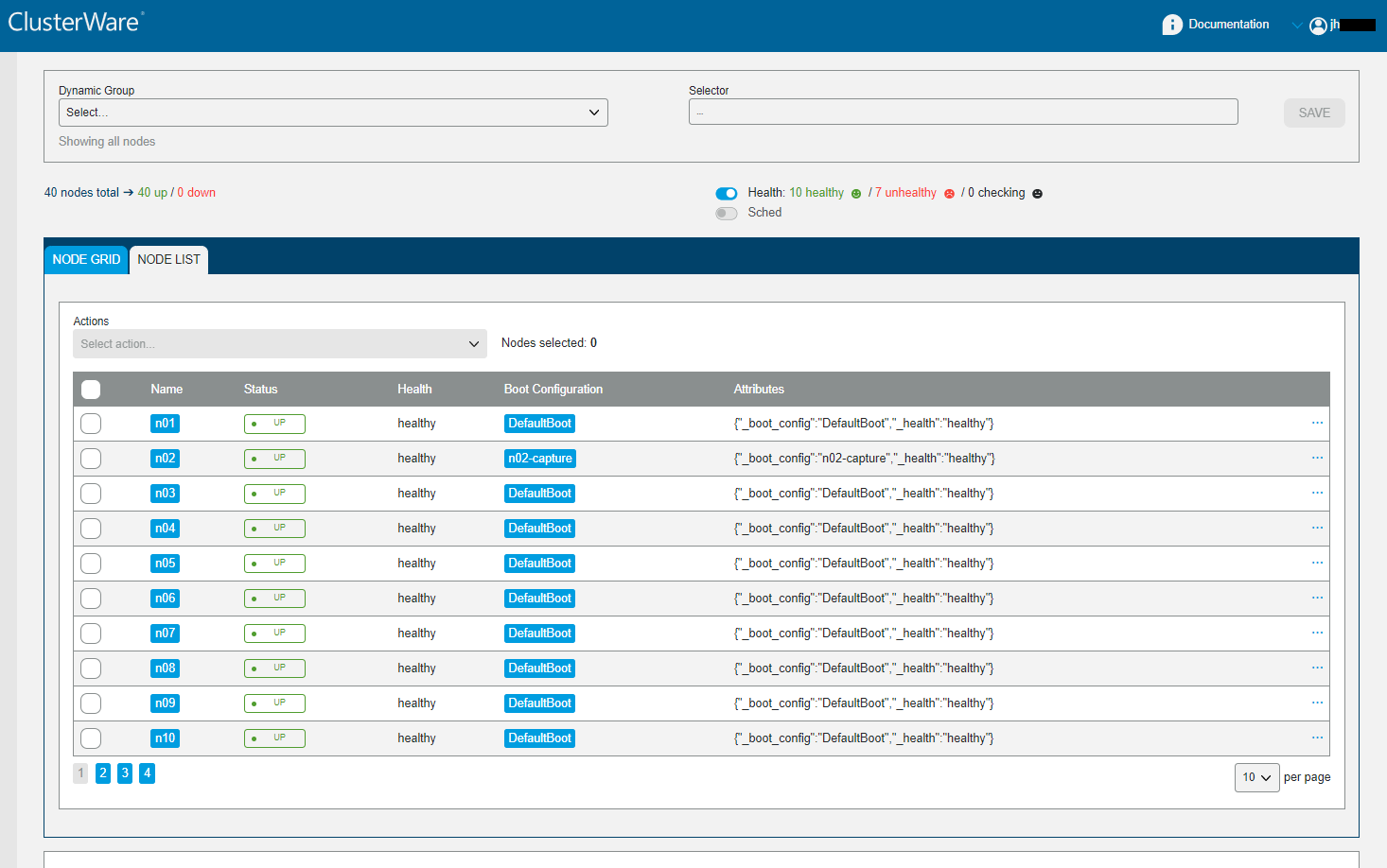
This display is the unfiltered list of nodes. This example cluster has 40 total nodes. Note the "10 per page" in the lower right and the page number selectors in the lower left.
Above the table you can note the existence "7 unhealthy" nodes. Suppose we filter for those nodes:
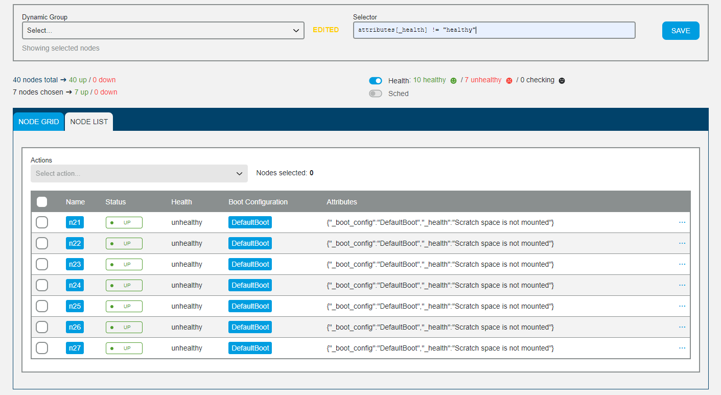
Now you see just the seven unhealthy nodes, and in their Attributes you can see why the health checking script has decided these are unhealthy: "Scratch space is not mounted".
Immediately above the table showing each node (as filtered or unfiltered) is an "Actions" text box. When the admin selects one or more nodes (either individual nodes by clicking on the box to the left of the node name, or all nodes by clicking on the box to the left of the title "Name"), then clicking in the "Select action" text box exposes several possible actions that can be taken against all the selected nodes. To the right of the "Actions" select menu indicates precisely how many nodes will be subject to the selected action.
The available actions:
Select action
Execute…
Soft Control: Reboot, Reboot - kexec, Reset, Shutdown
Hard Control: Power On, Power Off, Cycle Power
Other: Delete
Provisioning Page
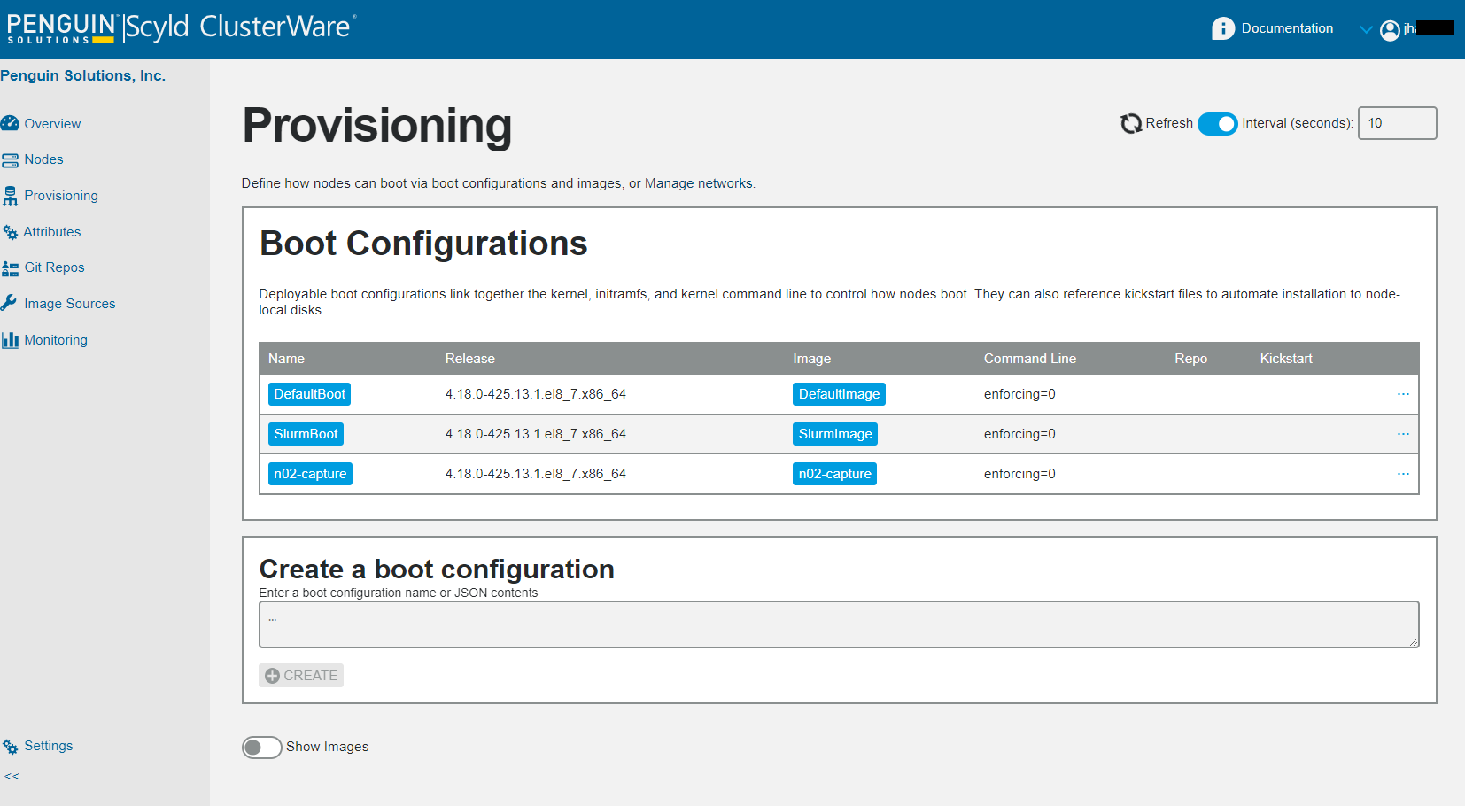
The Provisioning page shows a summary list of each boot configuration (with a clickable link to display details), its associated kernel release, and image name (with a clickable link to display details), the command line to send to each booting kernel, and optionally the repo name and optionally the kickstart name. Each detailed display allows editing or deleting current entries.
To edit, click on a boot configuration name to pop up a box displaying its details, then click on the padlock icon in the upper left of that box to unlock and display the editable items. When finished, either click "Save" or click on the "X" in the upper right to ignore any changes and close the edit box.
To delete a boot configuration, click on the "..." on the far right of the boot configuration entry to expose a "Delete" trashcan.
Below that is Create a boot configuration which allows the user to add a new boot configuration, either by name or by JSON contents.
Below the Create is a slider switch to expose an optional Images page:
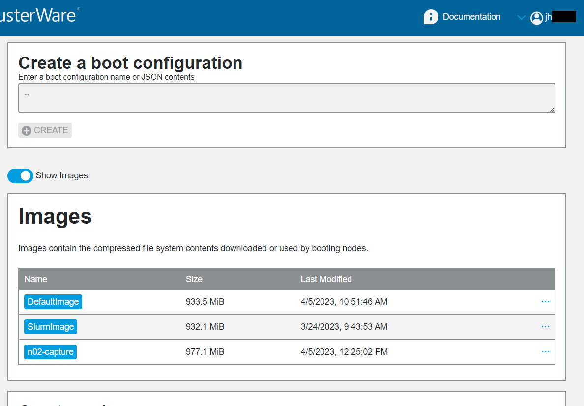
Basic information is displayed for each image. The more menu exposes a "Delete" trashcan.
Attributes Page
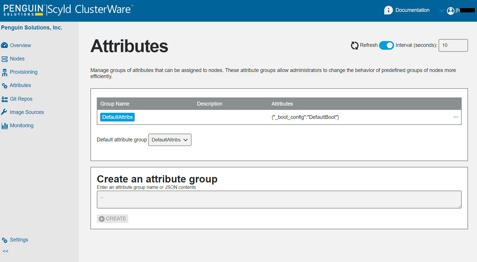
The Attributes page displays the list of attribute groups, plus a pulldown menu to change the specification of a default attribute group. Click on an attribute group name to see details.
To edit, click on a group name to pop up a box displaying its details, then click on the padlock icon in the upper left of that box to unlock and display the editable items. When finished, either click "Save" or click on the "X" in the upper right to ignore any changes and close the edit box.
To delete an attribute group use the more menu to expose a "Delete" trashcan.
The Create an attribute group at the bottom of the page allows the user to add a new attribute group name or specify JSON contents.
GIT Repos Page
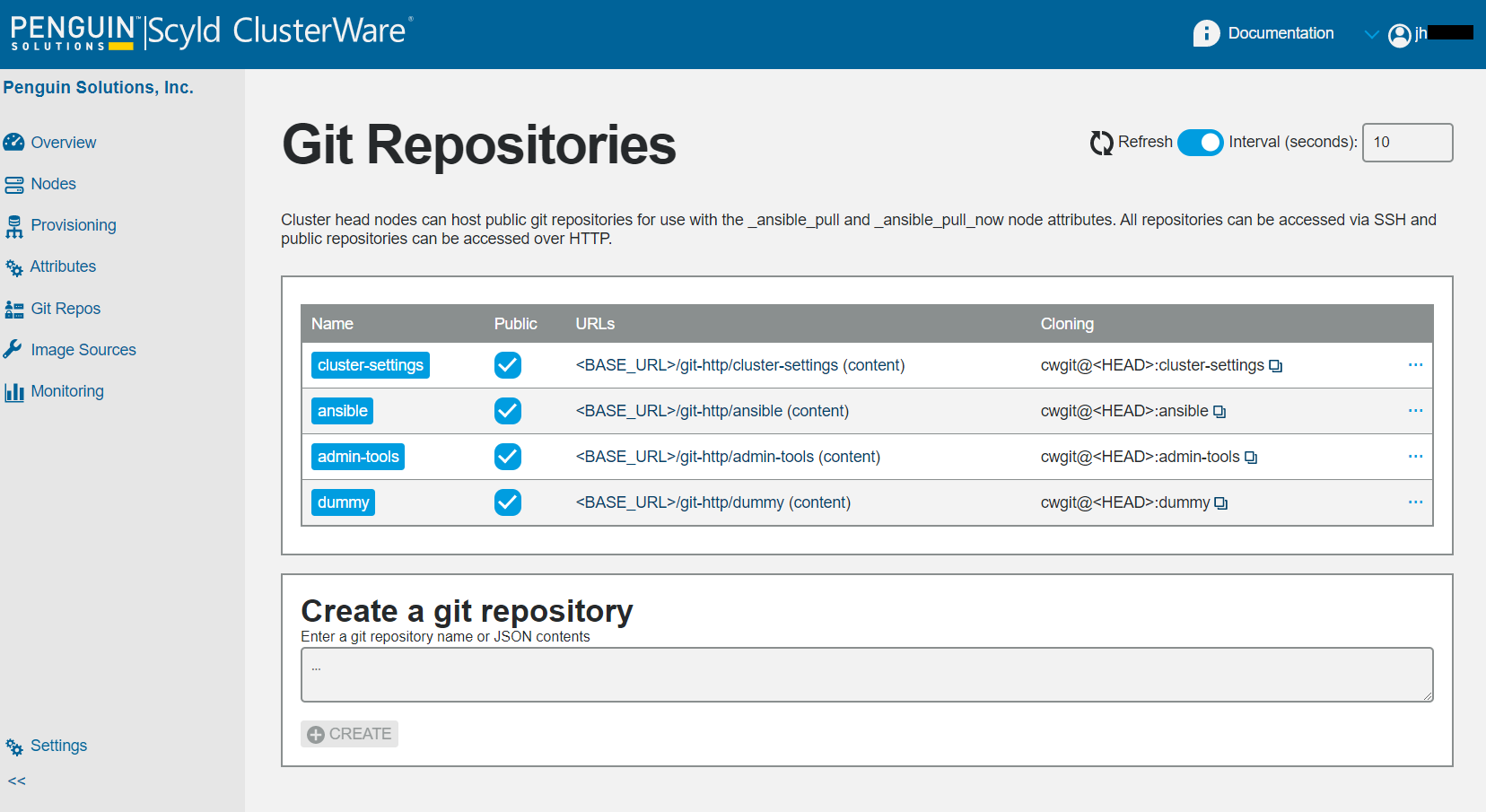
The Git Repositories page shows each available GiT Repo by name
(with a clickable link to details),
whether it is public or not, the URL to the bare repo (and contents),
and the argument that can be used to clone the repository via ssh.
Note that when copying the Cloning argument using the copy icon
(i.e., clicking on the two tiny stacked squares immediately to the right
of the entry's Cloning argument string),
a subsequent paste will replace the "<HEAD>" string
with the actual IP address from the current GUI website URL.
The Create a git repository text box at the bottom of the page allows the user to add a repository name or specify JSON contents.
Image Sources Page
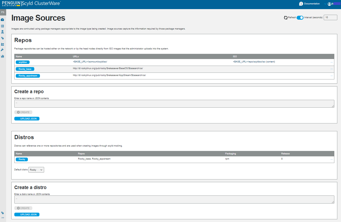
The Image Sources page shows two subpanels: Repos and Distros. The Repos subpanel shows the defined repos, and below that the Create a repo text box allows for adding a repo.
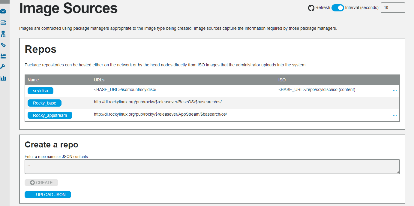
The Distros subpanel shows the defined distributions, and below that a Create a distro text box that allows for adding a distro.
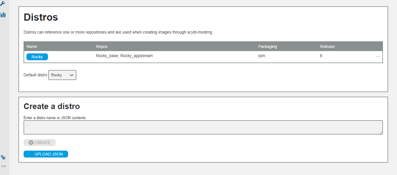
Individual entry details can be viewed or edited (if not frozen) by clicking on its name to pop up a box displaying its details, then click on the padlock icon in the upper left of that box to unlock and display the editable items. When finished, either click "Save" or click on the "X" in the upper right to ignore any changes and close the edit box.
Heads Page
The Overview page's ClusterWare Disk Usage panel has a pulldown menu in its upper right that selects a cluster head node to display.
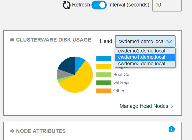
In example above, there are three headnodes. The selected head node displays details for the selected head node's ClusterWare disk usages for each of the various types of ClusterWare entities: ISOs, PXEboot images, boot configurations, Git repositories, "other", influxdb data, and the etcd database.
Note
These are just the proportional disk usages for ClusterWare entities, not for the node as a whole.
In this Disk Usage panel click on "Manage Head Nodes" in the lower right to open the Overview Heads page, aka ClusterWare Disk Usage, which displays details about every cluster head node.
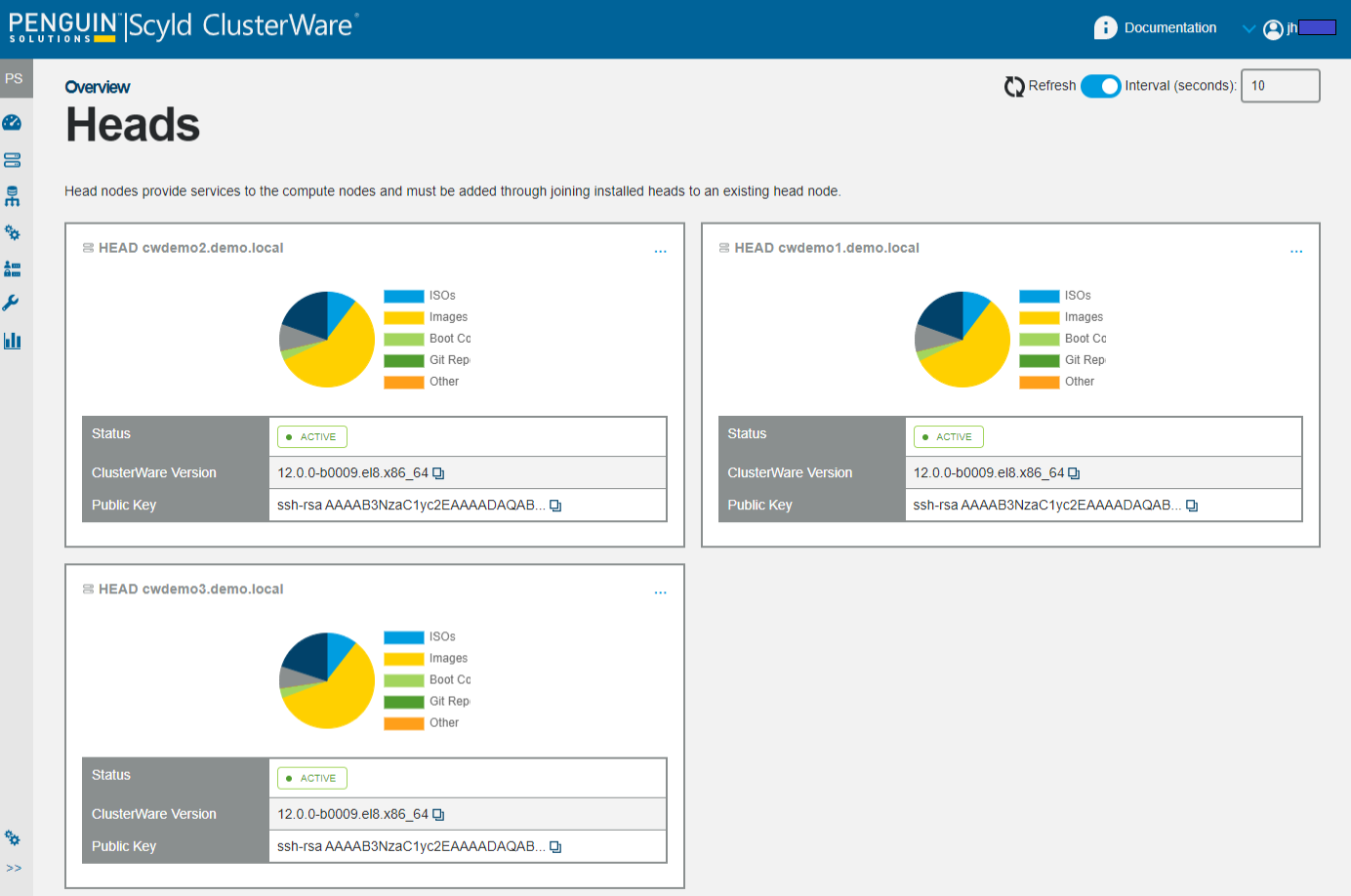
The Overview Heads page provides a view of basic head node status and allows users to copy information about the ClusterWare version or the public key that the head node uses to connect to compute nodes. The version is useful when reporting issue to Penguin support.
Although each head node's pie chart is likely to display small differences in the sizes of the pie components, you can hover the cursor over specific pie components to see their absolute sizes and note that the shared objects (e.g., ISOs, Images, Boot Configs) show the identical sizes across the head nodes.
The "Other" category consists of files in the ClusterWare storage directory that are not recognized by the system. These are usually files left behind during partial uploads, interrupted image cloning, or other failure cases. If the cluster is working as expected though there is space consumed by this "Other" category, those files can be removed via the "Clean storage/" option in the more menu. This is equivalent to executing the commandline:
scyld-clusterctl heads -i <HEADNODE> clean --files